The Light Lab has a great reputation within the industry – when and where did the story begin?
In March 2002 we brought together our combined skills in the fibre optic and lighting design industry, and project management to set up a design and build practice. The ethos was that whilst Architects and Lighting Designers create & draw up innovative and eye-catching schemes, even to the extent of specifying particular materials and light fittings, the knowledge of how materials and light work together is very specialist.
In addition the particular, often subtly unique, environment of any given installation, requires the final practical design to be both sympathetic to its specific needs and for the installation itself to be built with the design intent firmly in mind. Light is a very unforgiving medium, as our eyes are so sensitive to even the smallest variations in evenness & consistency once drawn naturally to lit areas. Our aim therefore was to provide a service to lighting designers and architects where we would take on their ideas and manage the process and physical installation to guarantee the highest standards of finishing and concept delivery.
We are able to offer an (often iterative) full mock-up service, which allows the interested parties to tweak design and visual impact and have a guarantee that the funds they have earmarked for their lighting feature, will result in an excellent result, on time and on budget.
You have been involved in a number of high end lighting installations, which one are you most proud of and why?
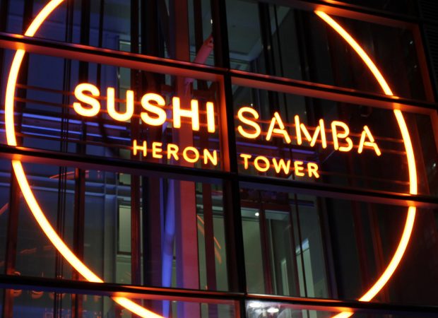
The glowing 5m Sushi Samba sign, with its completely seamless and trimless appearance – in a very bespoke font, mounted on the inside of a lift shaft inside the Heron tower, has become a London landmark and is a beacon of light even on the sunniest of days– and it’s pleasing that it is one of those features which most people recognise, and that it still looks as perfect 3 years on as it did the day we left site.
What has been your biggest challenge and how did you over come it?
Each project provides its own challenges, any feature has interfaces with the other elements and their contractors, which inevitably creates issues and has variances to drawings, and having the flexibility and ingenuity to resolve these, whilst retaining a sense of humour and avoiding the blame game is one of our strengths.
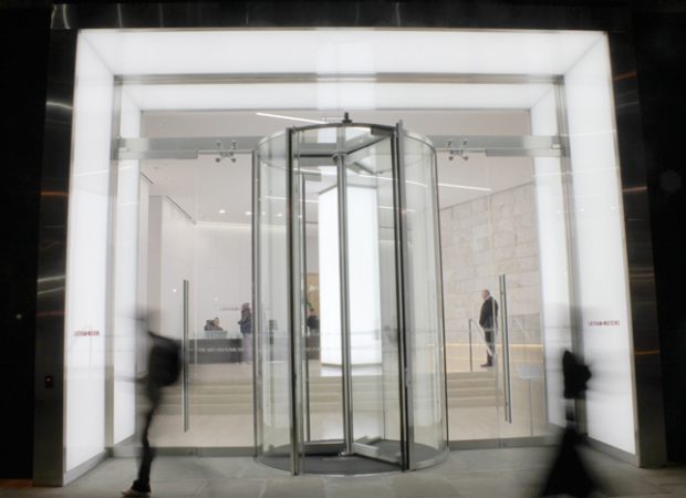
Building a lit entrance portal at 101 Bishopsgate for the legal practice Latham & Watkins, working with the architects Gensler proved interesting. The challenge was to design and build a fully even 7m wide x 6m tall portal both inside and outside the entrance doors, which had to be fully evenly lit and free-standing – we were not allowed to fix to any part of the existing structure of the building – for reasons of contractual responsibility between owners of the building and the tenants.
Working in cramped conditions behind a hoarding on Bishopsgate, under time pressure as tenants were moving in and we had not been allowed on site until 3 months after scheduled start date due to other works not having been completed on time – we knew we were up against it. We also built a 5m glowing column of light within the building and the 3.8m high glass entrance doors and in-fill panels. The logistics of getting 7m tall 1.5m wide bits of glass into the entrance on bishopsgate were interesting (since they clearly were too big to move through a building from its loading bay). This wasn’t helped by our attempt to do this during the night of new year’s day being stymied by the glazing company delivery truck driver having locked his keys and crane controller in the boot of his car – the poor bloke rang me at 3am in the morning, having broken his car window to try and gain entry to the boot and still failed to get in, almost in tears as he knew I had 7 people waiting in the cold at night during a public holiday for him to turn up.
We found a way, and It was pleasing that the 100mph winds of the st Jude storm that passed through that part of the city later in the year had no impact on our free-standing structure!
Your new Glowform product was released at 100% Design last year, What was the inspiration behind in and how has it been received in the market?
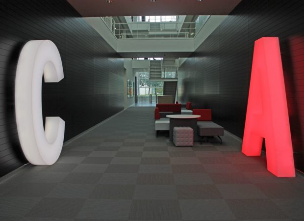
The inspiration was fed from our many projects where lighting designers have used the linear Glowline, providing features and detailing. We felt it was time to move from the linear and give designers the possibility of having a trimless glowing shape of any design, however complex (as we had realised in the Sushi Samba project), rather than the clunky lightboxes normally used. We have had few successful projects, notably the IMG studio lettering, which is a free standing 2.4m version and has been very well received.
What can we expect in the future from The Light Lab?
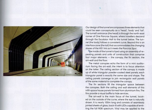
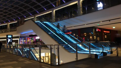
We are excited for the continued growth of The Light Lab; the scale, scope and prestigious nature of current projects is very encouraging – look out for lit glass bridges at JP Morgan’s new Victoria embankment offices, 100m of colour changing glass lightwall at the St Pancras Tunnel Link, within the King’s Cross development project. We are also working on specialist lighting features at Heathrow’s new Terminal 2a (lit glass staircase), as well as Terminal 3, Terminal 4 and Terminal 5 refurbishments. We have also recently taken on a new additional workshop in tower hamlets and have expanded our production team to cope with the increasing workload.
Architect’s Journal feature on the new Kings Cross, St Pancras Tunnel Link
