After spending some time at the recent Retail Lighting Expo I’ve been contemplating just how important the science of lighting is within a commercial and especially retail setting. Of course you have to show off products and ensure customers can see them in all their glory, but the actual process of lighting these spaces is complex and fascinating.
Lighting is just one of the factors retail designers must consider as they attempt to put customers in a comfortable environment, one where they are more willing to spend time and subsequently, their hard earned. To this end many scientists and companies invest in research, as they strive to find the ideal lighting conditions to maximize sales.
One study was carried out by the Royal Institute of Technology in Stockholm. It placed subjects in differently lit shopping environments to assess the impact lighting would have on purchasing behaviour. By tracking the eye movements of subjects as they walked through a virtual store and noting how they looked at merchandise under different lighting conditions, the study was able to make some extremely interesting conclusions.
Brighter isn’t necessarily better
Conventional wisdom would be to make stores as bright as possible so the merchandise is visible, but interestingly uniform bright lighting isn’t that effective. It can waste electricity and as the research points out, is not particularly conducive to maximising dwell time and sales.
Contrast is the key to grabbing the customer’s attention and using a mixture of light and dark areas is best practice. This is because contrast not only highlights certain products, but research subjects state that contrasted lighting makes them feel more comfortable and increases their perception. The reasons behind this are the role light plays in creating atmosphere and affecting our emotional state, which is why it is so important for retail designers to use contrast effectively.
Through the use of moderate ambient lighting within the store,combined with accurate accent lighting, retailers can draw the attention of the shopper to specific products. Such lighting (as the research suggests) performs better than a single source of light as it allows shoppers to pick out the products from the background noise.
White light plays a powerful emotional role
The colour of the light used is also important, with research identifying that cool white lights make areas seem more spacious and warmer colours providing characteristics of familiarity and intimacy. Overall however, it has been found that an intermediate to warm white light will make shoppers feel safer and more comfortable, subsequently extending the time they spend in a store.
Accent lighting on lower shelves can make a big impression
Naturally products on low shelves draw less attention than those in the immediate eye-line. Clever use of accent lighting on lower shelves can increase the prominence of products, but for those that want to maximise sales, combining shelf backlighting with accent lights can have a dramatic effect. Shops hoping to achieve this effect should look at integrated lighting options, to improve the attractiveness of merchandise on all shelves.
Choosing the right lights
While the study made some interesting general observations, the process of using light within any specific retail space still requires design. The application of these recommendations however depends largely on the type of store being kitted out. For example, a large hardware store is going to be well served by bright lighting with minimal accenting as on the whole, customers aren’t there to browse but to look for a specific product. In contrast, shoe shops can make the most of warm white background lighting with accents and backlights on shelves, increasing the time customers spend in store and the attractiveness of products.
The choice of lights depends largely on the situation and the desired emotional effects, which is why it is so important to make the choice after serious and careful consideration.
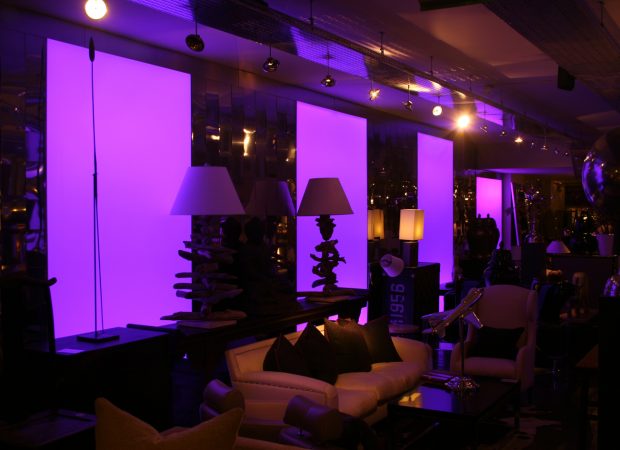
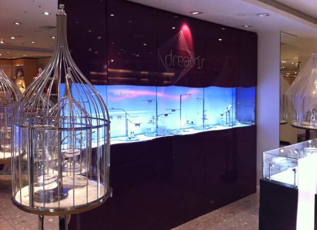
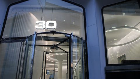
Here are some of our most memorable retail lighting design projects.
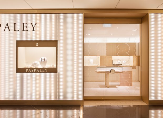
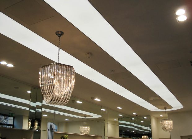
Image © Lisa Wetherell
